07.30.13
Posted in Weather Education, Weather News at 2:34 pm by Rebekah
This time of year is getting into wildfire season in the West, and here in Washington we’ve already had some significant ones.
I’ve been back in the Pacific Northwest for the last couple of weeks, busily running around Washington and Oregon visiting family and friends and preparing for my move to New Zealand on Sunday. This past Saturday my parents and I drove down for an overnight trip to see my grandparents in central Oregon. We had to take a longer-than-normal way down, as a wildfire in south central Washington had forced the highway over Satus Pass to be shut down.
Sadly the weather has been prime lately for fires, and we saw a fair amount of smoke around on the drive down and back. We’ve had some strong ridges of high pressure sitting over the Northwest lately, bringing 90s to 100s F temperatures and a general lack of rainfall. It obviously doesn’t take much then to start a fire when the wind picks up, and most of these fires tend to be caused by a careless toss of a cigarette.
Coming back to central Washington Sunday evening, as we crested the last ridge before looking down into Kittitas Valley (where my parents live), we got a good look at the smoke from a new fire growing just over the opposite ridge.
What I was most fascinated with was the towering pyrocumulus clouds.
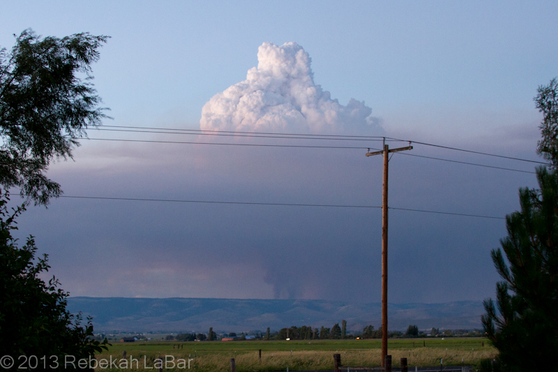
Pyrocumulus cloud growing above a smoke column northeast of Ellensburg, WA
The basic principle behind cloud formation is water vapor condensation onto tiny particles called cloud condensation nuclei (CCN). These CCN could be sand, dust, salt, … or in this case ash.
A fire in effect seeds the atmosphere, and the hot air above the flames can generate rapid and robust convection (rising air) that results in a puffy-looking (cumulus) cloud if there is enough moisture in the air.
Such cumulus clouds that form as a result of fires and volcanoes are known as pyrocumulus, or even pyrocumulonimbus if they grow large enough to produce a heavy shower or thunderstorm.
While the phenomenon is not uncommon, I had rarely seen such a well-defined example. A visible satellite loop from Sunday shows a series of pyrocumulus forming over the fire’s hotspot, and then moving off to the east (due to upper-level winds) as others form over the fire.
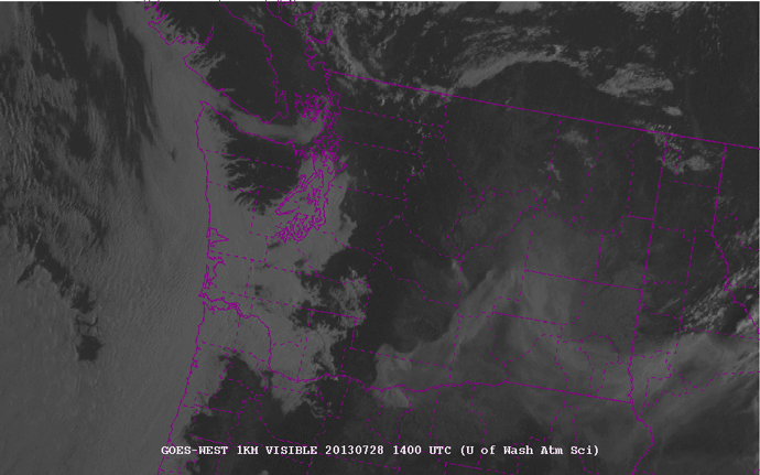
1-km visible satellite loop of Washington State, from 7am to 9pm local (PDT) on 28 July 2013. Counties are outlined in purple. Courtesy of the University of Washington - http://www.atmos.washington.edu/cgi-bin/list.cgi?vis1km. Click to enlarge.
The fire in the northeast corner of Kittitas County (center of the state) is evident from the eastward-moving smoke plume. Later in the afternoon, about 3pm (2200 UTC), you can start to see the series of whitish knobs forming on top of the fire. These are the pyrocumulus. They really start to explode around 5 to 6pm (0000-0200 UTC).
As an aside you can also see the fire in south central Washington, although there are not so many pronounced pyrocumulus clouds on the smoke plume.
There may have been a little bit of rain falling from the cloud, but a radar loop showed a stationary spot of reflectivity that was in the location of the fire. Fires are not always visible on radar, but sometimes they are large enough for the ash particles to reflect the radar beam and appear to be stationary “rain” showers.
I didn’t save a loop, but here’s a single image from Sunday night, showing the fire to my northeast.
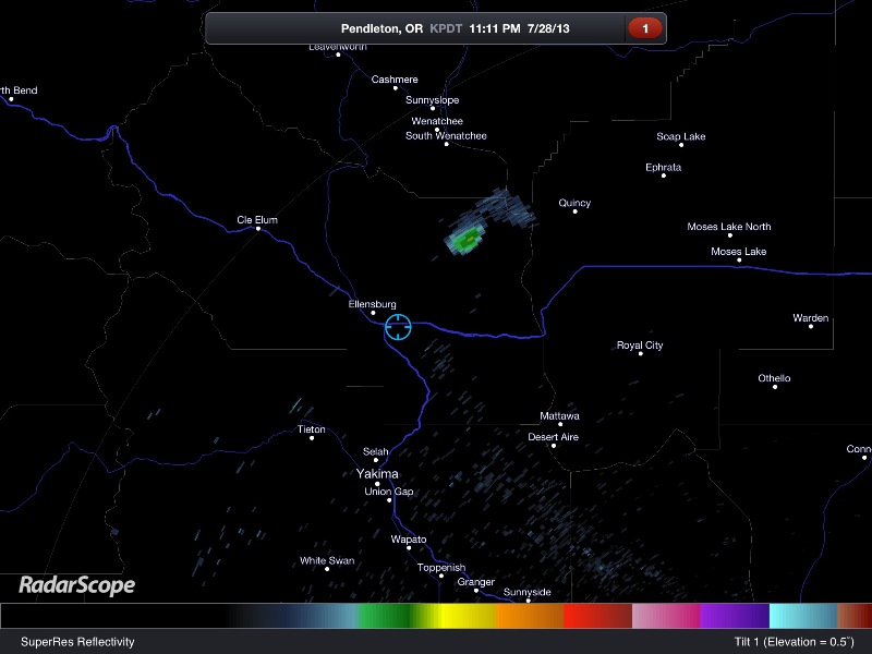
RadarScope image of the Pendleton, Oregon radar reflectivity. The blue circle shows my location, and the greenish blob to my northeast is the fire.
InciWeb (Incident Information System) has updated information and maps of the fire (and others) here: Colockum Tarps Fire. News articles today say nearly 70 square miles are up in flames and it is only 5% contained. The winds are fairly light now, but later in the week we could get a bit more wind and a slight chance for thunderstorms.
So far the fire has been mostly on grasslands, but if it spreads further west, it will become much harder to fight in the timberland. And if it spreads further south, it may start to threaten some homes and a wind farm.
Here’s hoping the firefighters get some better weather for fighting the fires, and everyone and their homes stay safe.
Permalink
12.03.12
Posted in Non-US Weather, Tropical Weather, Weather Education, Weather News at 5:09 pm by Rebekah

Typhoon Bopha narrowly missed Palau last night on its westward track through the west central Pacific. The typhoon has weakened slightly from the equivalent of a Category 4 on the Saffir-Simpson Scale to a Category 3 as it makes its way towards the southern Philippines.
It is unusual for a strong typhoon to exist so close to the equator; a recent article from The Weather Channel points out that Bopha is the strongest typhoon to track through the southern Philippines in 22 years.

Bopha’s history (above) and 5-day forecast (below); Kwajalein Atoll (where I live) is circled in red. All images courtesy of Weather Underground.

But why is this unusual? Put simply, tropical cyclones require a certain amount of rotation to be able to strengthen. You probably know that wind in the Northern Hemisphere is deflected one way, while wind in the Southern Hemisphere is deflected the other way–this is known as the Coriolis force.
The closer you are to the poles, the stronger the deflection; which means the closer you are to the equator, the less the wind favors deflecting one way or the other. Even if you have all the other necessary “ingredients” for a tropical cyclone to form, if the trough of low pressure does not start to rotate, or does not rotate very much, the central pressure will fail to deepen and the wind speeds will not increase very much (remember, the stronger the pressure gradient, the stronger the winds as the atmosphere tries to balance out the pressure differences — see Meteorology 101: Elements of Weather – Wind).
Generally you will not see tropical cyclones forming between about 5°N and 5°S, let alone strengthening to Category 4 storms. This is why here at Kwajalein, at 8°N, we don’t expect we could get much more than the equivalent of a Category 2. Many tropical cyclones form near the Marshall Islands, but in order to get a stronger storm tracking through, it would need to form further upstream and closer to the equator, which is possible but not very common.
See also one of my previous posts on how tropical cyclones form: Tropical Cyclones: How They Form, Move, and Strengthen (aka, What Danielle, Earl, and Frank Are Up To) – Part 1
Permalink
05.09.11
Posted in Weather Education at 8:00 am by Rebekah
The last post in the weather education series (now three weeks ago!) dealt with upper-air maps, including pressure surfaces and the basics of how to read upper-air maps. The last segment of reading weather maps will be on soundings, but I will break it up into two posts.
Soundings
Remember when we discussed upper-air observations? Instruments called radiosondes are attached to balloons and launched into the atmosphere twice a day around the world. Radiosondes collect temperature, pressure, humidity, and wind data.
An atmospheric sounding is a vertical profile of the atmosphere, meant to be representative of the atmospheric conditions at the point at which the balloon was launched.
Soundings are plotted on a variety of charts.
Meteorologists most frequently look at sounding data on a Skew-T Log-P diagram, often just called a Skew-T for short.
Skew-T Log-P Axes
Here is an example of a Skew-T Log-P diagram, showing Norman’s 00Z sounding (7 pm local time on Sunday). The chart came from the Storm Prediction Center, one of my favorite places to look at soundings.

You are looking at a vertical profile here, so the bottom of the chart is the surface, and the top of the chart is up near the top of the atmosphere.
The black numbers on the left side of the diagram are pressure values in millibars (remember 1000 mb is near the average sea-level pressure, 500 mb is near the middle of the atmosphere, and 100 mb is near the top of the atmosphere).
Note the pressure is plotted logarithmically (the hash marks spread out as you go up). This is where the “log-p” of this diagram comes from (logarithmic pressure).
The red numbers on the left side of the diagram are altitude values in kilometers (SFC means the surface, where the balloon was launched).
The black numbers on the bottom of the diagram are temperature values in degrees Celsius. Note the temperature lines are tilted up to the upper right (the light pink dashed lines). This is where the “skew-t” of the diagram comes from (skewed temperature).
Reading A Skew-T
After you understand the main axes on a Skew-T diagram, take a look at the two solid bold lines on the chart.
The red line represents the temperature of the atmosphere, while the green line represents the dewpoint. These lines may be different colors or even the same color on other Skew-T diagrams, so the main thing you should remember is that the dewpoint can never be greater than the air temperature, so the dewpoint line is always on the left and the temperature line is always on the right.
The next thing you should notice is the wind barbs on the right side of the diagram. These wind symbols are the same as those you would see on a surface or upper-air map. Each wind symbol represents the wind speed and direction at that level of the atmosphere.
Ignore all other lines on this diagram for now.
Now you should start to be able to make sense of what is going on in the diagram.
Skew-T Example
The surface temperature and dewpoint have been nicely labeled on this diagram, in degrees Fahrenheit. In this example, the surface temperature is 86 °F and the surface dewpoint is 68 °F.
Note the temperature (red line) decreases with height from the surface up to about 850 mb. The temperature then briefly increases with height (known as a temperature inversion), before going on to decrease with height. The dewpoint follows much the same pattern.
Now look at the winds. The surface wind is out of the southeast at 10 knots (11.5 mph), but the wind direction changes to the west and speed increases with height. When the wind direction changes in a clockwise manner, we say the wind is veering, but when it changes in a counter-clockwise manner, we say the wind is backing. In this case, the wind is veering with height. We will later see that this is a good thing for promoting severe thunderstorm development.
We will spend a lot more time with soundings in the future, so it is important to become familiar with what the basic lines mean.
Soundings plotted by the Storm Prediction Center may be found here.
Soundings plotted by the College of DuPage may be found here (go to Upper-Air Products, Upper-Air Soundings).
Soundings plotted by the Oklahoma Weather Lab (University of Oklahoma School of Meteorology student forecasting lab) may be found here.
————————————————–
Next Monday I plan on discussing another type of upper-air chart, called a hodograph, which we use to quickly assess wind direction and speed with height.
Follow Green Sky Chaser on Twitter and Facebook for weather, chasing, and blog updates.
Permalink
04.18.11
Posted in Weather Education at 8:00 am by Rebekah
Last week in the weather education series we looked at contouring weather maps, in an effort to make the weather data easier to quickly understand. Now that we have covered surface maps, we’ll move on to making sense of upper-air maps.
Pressure Surfaces
Before we study the data shown on an upper-air map, we first have to understand what an upper-air map is.
Most of the time, when looking at upper-air maps, meteorologists are looking at the observations on a constant pressure surface rather than a constant height/altitude surface. This means that no matter where you look on that map, the pressure will be the same.
For example, a 5,000-m map would be a slice of the atmosphere at 5,000 m, such that everywhere on the map is 5,000 m above sea level. You would then have observations across the map reporting different pressure readings.
On the other hand, a 500-mb map would be a slice of the atmosphere at 500 mb, such that everywhere on the map has a pressure reading of 500 mb. In this case, you would have observations across the map reporting different altitude readings (i.e., at what height the pressure 500 mb was found).
This may sound somewhat strange, but it is customary for meteorologists to use pressure, rather than altitude, as a vertical coordinate, in order to simplify thermodynamic computations (we won’t get into that here).
Common Pressure Surfaces
Here are some common pressure surfaces that we look at, and the approximate altitude of each (varies by latitude, time of year, and atmospheric factors):
- 850 mb — 1.5 km
- 700 mb — 3.0 km
- 500 mb — 5.5 km
- 300 mb — 9.0 km
- 250 mb — 10.5 km
- 200 mb — 12.0 km
(Remember that pressure decreases with height, and standard sea-level pressure is 1013 mb.)
500 mb is a standard pressure surface for the mid-levels of the atmosphere…if I could only look at one upper-air map, I’d pick this one, so I can get a good overview of troughs, ridges, and mid- to upper-level winds.
The jet stream (band of fast moving air that circles the globe, high up in the atmosphere…more on this in a future post) is best seen on a 200 mb, 250 mb, or 300 mb map. We’ll get more into what levels are good for what later on.
Upper-Air Map Example

Here is an example of an upper-air map from the Storm Prediction Center (more maps can be found here).
The bottom of the map (click to enlarge) tells you what the map is showing: 110416/0000 500 MB means this is a 500-mb (mid-level) map containing data from 16 April 2011 at 00Z, or 7 pm Friday if you live in the US central time zone. UA OBS means upper-air observations are shown, HGHTS means the pressure heights are contoured (solid gray), and TEMPS means the temperatures are contoured (dashed red).
Upper-air symbols are interpreted much the same way as surface symbols, except for surface temperature and dewpoint are given in °F in the US, while upper-air temperature and dewpoint are always given in °C (don’t ask me why!). Also, remember that instead of pressure observations at each station, we report height observations (e.g., the altitude at which the pressure reads 500 mb).
There are also some special rules about interpretation of height values, such as in this case the units are decameters, so a value of 584 means 5,840 meters. For now anyway, though, the values are not that important.
The important thing here is to note the overall pattern. There was a trough of low pressure over the central US this day, and a ridge of high pressure over the eastern US. Later in the series we’ll get more into what these terms mean.
————————————————–
Next Monday we will move on to interpreting balloon soundings, another type of weather map/chart!
Follow Green Sky Chaser on Twitter and Facebook for weather, chasing, and blog updates.
Permalink
04.11.11
Posted in Weather Education at 8:00 am by Rebekah
Last week in the weather education series we went over how to decode surface maps; i.e., how to plot weather data and how to interpret data that has already been plotted. Now we’ll make more sense of all the weather data by contouring some of the data.
Contouring Weather Maps
Take a look at the surface map we used as an example last week.

Even if we know how to read this map, we’ll be able to more quickly interpret what’s going on if we draw some contours and other symbols.
By drawing contours, I mean drawing isolines: lines of equal measurement.
For example, say we want to contour temperature every 5 degrees, starting with 60 °F. We will then look the temperature recorded at each station, and draw a line through where we expect to find a temperature of 60 °F. Areas above 60 °F will be on one side of the line, and areas below 60 °F will be on the other side of the line. Points with a temperature of exactly 60 °F will be on the line. The next step would be to draw a contour of 55 °F or 65 °F, until we have drawn lines every 5 degrees.
There are a few rules when it comes to drawing contours.
- Contours should never cross or touch (it surely can’t be both 60 °F and 70 °F at the same point!)
- Contours should be smooth; no corners (this isn’t dot-to-dot…contours should be a bit rounded)
- Do not draw in any more details than the data allow (you should not draw dramatic curves where there is no station data to support this…also, you should not draw a 60 °F circle inside a 65 °F circle unless there is a station inside the circle with a temperature of less than 60 °F)
- Contours should be closed or reach the edge of the map (do not start a line in the middle of the map or leave one hanging)
- Contours should be labeled (don’t forget to write 60 °F on or at the end of the 60 °F contour)


Here is a simplified example of drawing temperature contours every 1 degree:

And here is an example of pressure contours every 2 millibars (along with wind barbs and radar reflectivity) from the Storm Prediction Center last night:

Types of Contours
Here are the names for a few common types of contours, or isolines (remember “iso” means “equal”)
- isotherms – lines of equal temperature
- isobars – lines of equal pressure (remember the basic pressure measurement is a bar, or millibar)
- isodrosotherms – lines of equal dewpoint temperature
- isotachs – lines of equal wind speed
- isoheights – lines of equal heights (we’ll get to what this means later, once we move to upper-air maps)
So, for example, the first simplified map showed isotherms, while the map of the Midwest and Northern Plains showed isobars. You will often see isobars plotted on surface maps.
Other Weather Symbols
You may also see the following front and dryline symbols commonly plotted on surface maps, as well as a large red “L” indicating a low pressure center and a large blue “H” indicating a high pressure center. We will talk about fronts and drylines later in the series.

Here’s a map from The Weather Channel from last night, showing isobars, radar, lows and highs, and fronts (ignore the brown dashed lines for now…those are troughs).

————————————————–
Next Monday we will move on to upper-air maps!
Follow Green Sky Chaser on Twitter and Facebook for weather, chasing, and blog updates.
Permalink
« Previous entries Next Page » Next Page »