05.09.11
Meteorology 101: Atmospheric Sounding Charts
The last post in the weather education series (now three weeks ago!) dealt with upper-air maps, including pressure surfaces and the basics of how to read upper-air maps. The last segment of reading weather maps will be on soundings, but I will break it up into two posts.
Soundings
Remember when we discussed upper-air observations? Instruments called radiosondes are attached to balloons and launched into the atmosphere twice a day around the world. Radiosondes collect temperature, pressure, humidity, and wind data.
An atmospheric sounding is a vertical profile of the atmosphere, meant to be representative of the atmospheric conditions at the point at which the balloon was launched.
Soundings are plotted on a variety of charts.
Meteorologists most frequently look at sounding data on a Skew-T Log-P diagram, often just called a Skew-T for short.
Skew-T Log-P Axes
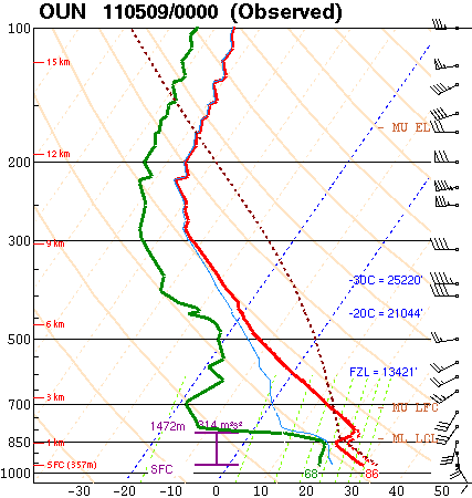
Here is an example of a Skew-T Log-P diagram, showing Norman’s 00Z sounding (7 pm local time on Sunday). The chart came from the Storm Prediction Center, one of my favorite places to look at soundings.
You are looking at a vertical profile here, so the bottom of the chart is the surface, and the top of the chart is up near the top of the atmosphere.
The black numbers on the left side of the diagram are pressure values in millibars (remember 1000 mb is near the average sea-level pressure, 500 mb is near the middle of the atmosphere, and 100 mb is near the top of the atmosphere).
Note the pressure is plotted logarithmically (the hash marks spread out as you go up). This is where the “log-p” of this diagram comes from (logarithmic pressure).
The red numbers on the left side of the diagram are altitude values in kilometers (SFC means the surface, where the balloon was launched).
The black numbers on the bottom of the diagram are temperature values in degrees Celsius. Note the temperature lines are tilted up to the upper right (the light pink dashed lines). This is where the “skew-t” of the diagram comes from (skewed temperature).
Reading A Skew-T
After you understand the main axes on a Skew-T diagram, take a look at the two solid bold lines on the chart.
The red line represents the temperature of the atmosphere, while the green line represents the dewpoint. These lines may be different colors or even the same color on other Skew-T diagrams, so the main thing you should remember is that the dewpoint can never be greater than the air temperature, so the dewpoint line is always on the left and the temperature line is always on the right.
The next thing you should notice is the wind barbs on the right side of the diagram. These wind symbols are the same as those you would see on a surface or upper-air map. Each wind symbol represents the wind speed and direction at that level of the atmosphere.
Ignore all other lines on this diagram for now.
Now you should start to be able to make sense of what is going on in the diagram.
Skew-T Example
The surface temperature and dewpoint have been nicely labeled on this diagram, in degrees Fahrenheit. In this example, the surface temperature is 86 °F and the surface dewpoint is 68 °F.
Note the temperature (red line) decreases with height from the surface up to about 850 mb. The temperature then briefly increases with height (known as a temperature inversion), before going on to decrease with height. The dewpoint follows much the same pattern.
Now look at the winds. The surface wind is out of the southeast at 10 knots (11.5 mph), but the wind direction changes to the west and speed increases with height. When the wind direction changes in a clockwise manner, we say the wind is veering, but when it changes in a counter-clockwise manner, we say the wind is backing. In this case, the wind is veering with height. We will later see that this is a good thing for promoting severe thunderstorm development.
We will spend a lot more time with soundings in the future, so it is important to become familiar with what the basic lines mean.
Soundings plotted by the Storm Prediction Center may be found here.
————————————————–
Next Monday I plan on discussing another type of upper-air chart, called a hodograph, which we use to quickly assess wind direction and speed with height.
